Our Visitor-friendly Signs
Unobtrusive, but there when you need them
On hand when needed, but never intruding on museum visitors, the signs found in and outside of our museum that show the viewer route through the museum and its facilities are designed to provide the best environment to bring museum visitors and the art together. These designs reflect our conception of signs as a presence that should remain unobtrusive when visitors are viewing the artworks but are right there in front of their eyes when they need to choose their next destination.
Prim and Welcoming Pictograms
The signs seen in the museum today were designed by noted graphic designer Yoshiaki Irobe at the time of the museum’s renovation in 2008. The process of conceptualizing what form the signs should take began with a “personification” process that involved determining what kind of person would be best for guiding visitors through the museum. Repeated discussions with the museum staff led to the idea that the “guides” should be robust, speaking clearly and succinctly. Adding to this image consideration for the quiet and gentle surroundings of the museum, the final image carefully defined for the pictograms was ones that appear “prim and proper but welcoming in nature.” It led to designs that have simple but robust lines and a character befitting the museum that is sound with a sense of welcoming familiarity.
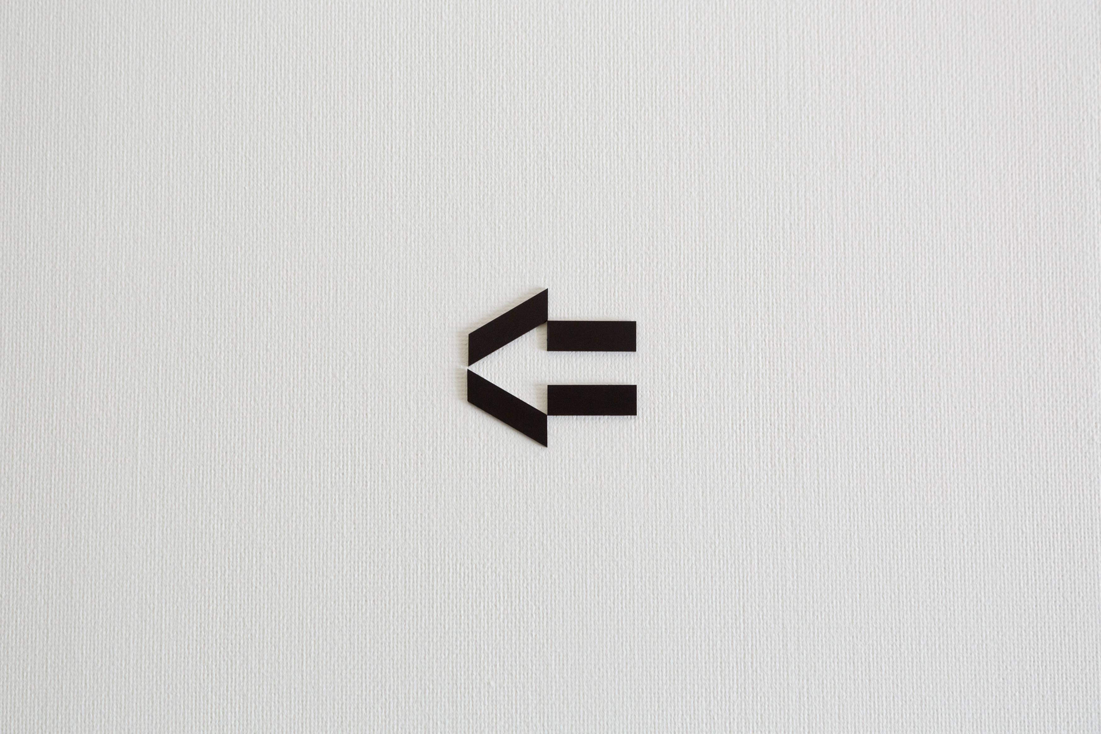
“Arrows” showing both the direction and what route to take
There are arrows positioned at specific places both inside and outside the museum. And the reason why each arrow has a different shape is to show not only the initial direction but also the route to follow after that. The lengths of the arrows show the distance to be walked, and the arrow’s shape shows the shape of the route and the stairs to be climbed or descended. The shapes are designed to give visitors intuitive images of the details of the route they should follow.
A font chosen to fit one concept
The same concept applied for our pictograms was also used for selection of the font used on the information boards, for captions and printed materials. If the pictograms we use represent people, the font can be seen as a "voice" to be chosen with consideration for the museum environment. So a suitable color or tone of that voice was chosen. We have also spent a significant amount of consideration to improving our sign readability, in order to accommodate visitors of all ages.